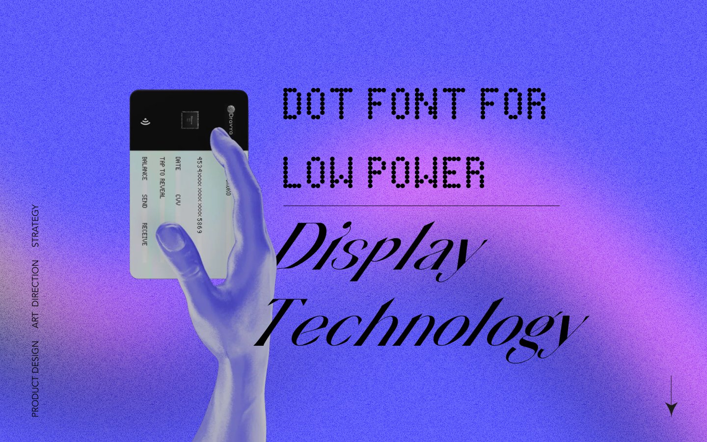
Designing a Readable Font
for Digital Payment Card
A human-centric approach to designing a pixel-optimised typeface for electrochromic displays under extreme technical constraints.
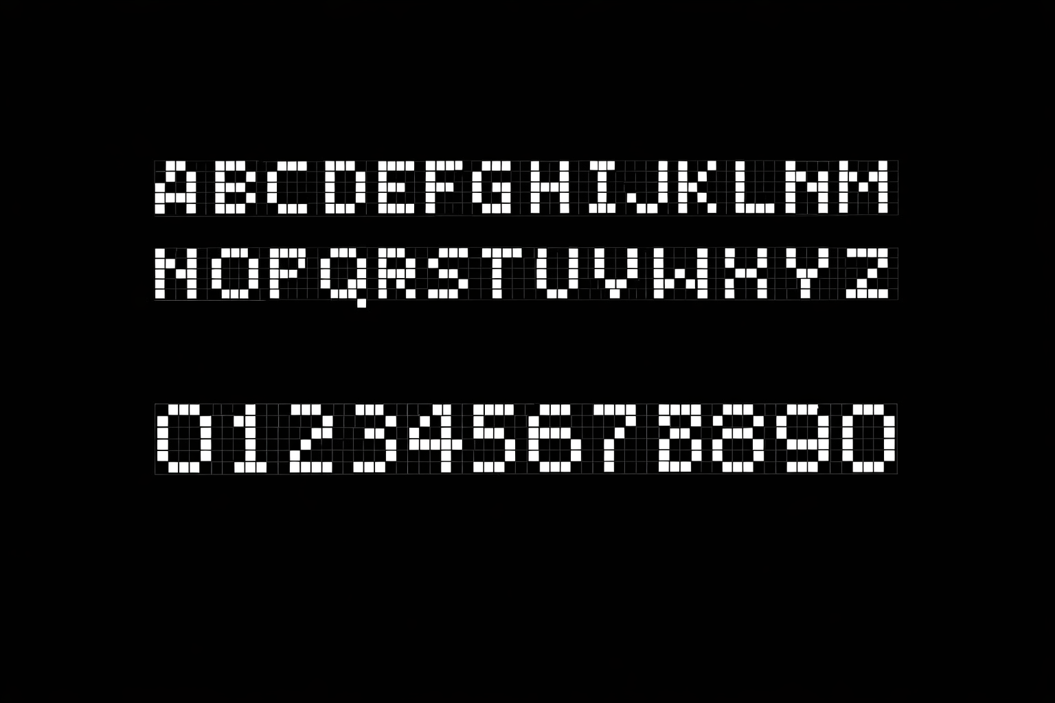
How do you make text readable with only 35 pixels?
Low-power, low-resolution electrochromic displays in compact payment interfaces need clear alphanumeric presentation. A 7×5 pixel matrix severely limits legibility—existing fonts fail these constraints, causing cognitive load and potential misreads.
7×5
Pixel Matrix
35
Total Pixels Available
6
Font Approaches Tested
47
Survey Participants
Design Process
Understanding the
Design Brief
Research
Synthesis & Design
Usability Testing
Finished Product
Key Research Insights
Academic literature revealed four principles critical for low-resolution typography design.
Holistic Recognition
Humans recognise characters by overall shape and silhouette, not dot-by-dot. The gestalt matters more than individual pixels.
Dot Composition
Connected dots create implied strokes that the brain interprets as continuous lines, dramatically improving legibility.
Error Amplification
7×5 matrices amplify perceptual errors. Characters sharing structural similarities become nearly indistinguishable.
Visual Noise
Angular dot boundaries increase cognitive strain. Rounded elements reduce visual noise and improve readability.
Understanding Segmented Displays
Before designing for dot matrices, we studied the evolution of segmented displays—from 7-segment to 16-segment—to understand fundamental constraints of low-resolution character rendering.
Evolution of Segment Displays
7-Segment Display
Since 1903 • 128 possible patterns
Only numerals 0-9 are unambiguous. Letters K, M, V, W, X, Z cannot be displayed. B/8 and D/0 conflicts.
14/16-Segment Display
Full alphanumeric support
Diagonal segments enable M, W, X, K. Higher cost and complexity. Used in VCRs and car dashboards.
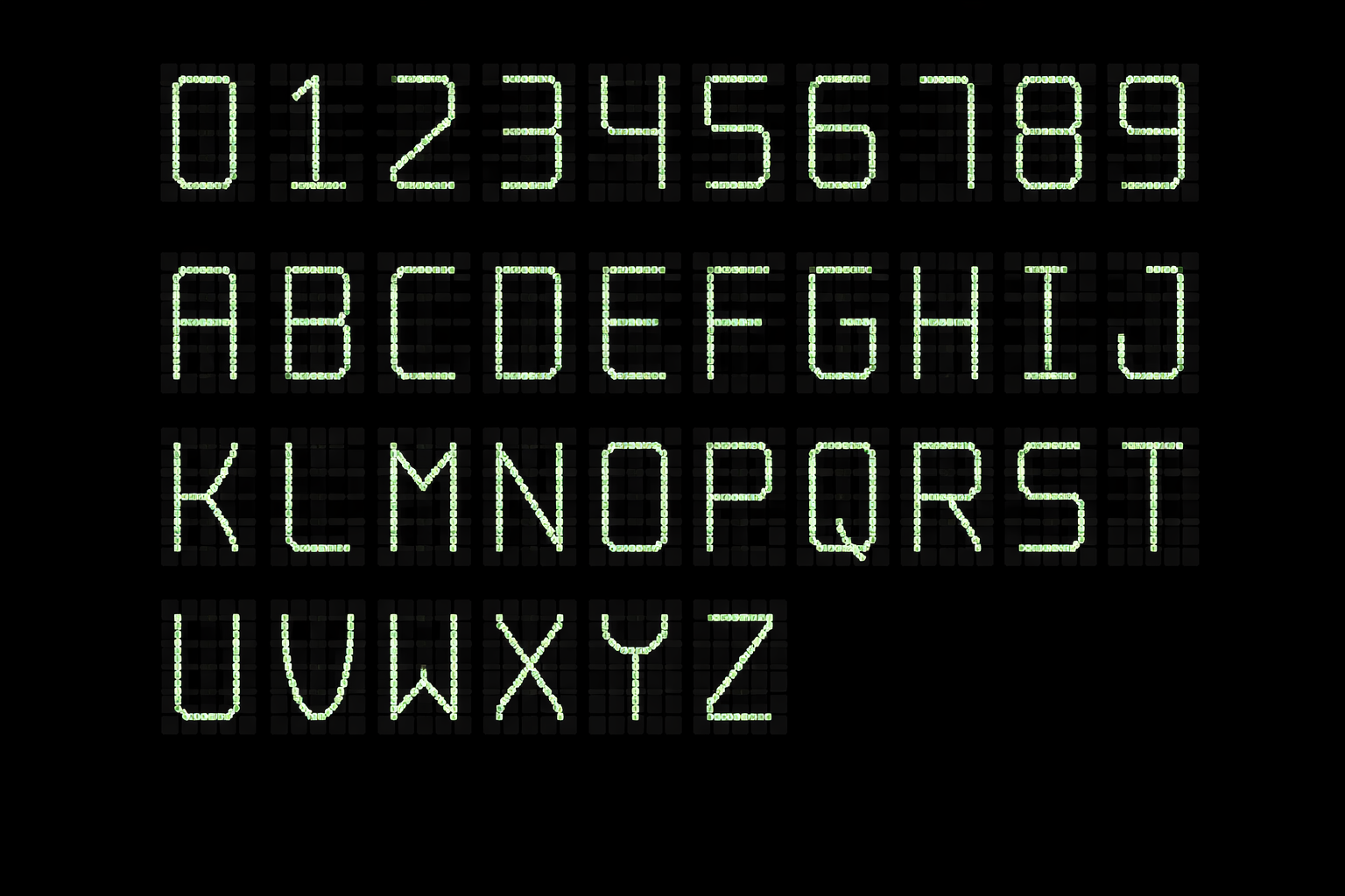
Dot Matrix (7×5)
35 pixels • Flexible rendering
Any character possible but legibility depends on font design. Our focus: optimizing for electrochromic payment displays.
7-Segment Character Conflicts
The fundamental limitation: 2⁷ = 128 patterns must represent all alphanumerics. This creates unavoidable conflicts:
B = 8
IDENTICAL
D = 0
IDENTICAL
S = 5
SIMILAR
Z = 2
SIMILAR
Impossible Characters
K M V W X
Require diagonals or 3+ vertical strokes
7-segment displays prove that constraint breeds ambiguity. Our 7×5 dot matrix offers 35 pixels vs 7 segments—5× more flexibility—but similar confusion risks persist without careful font design.
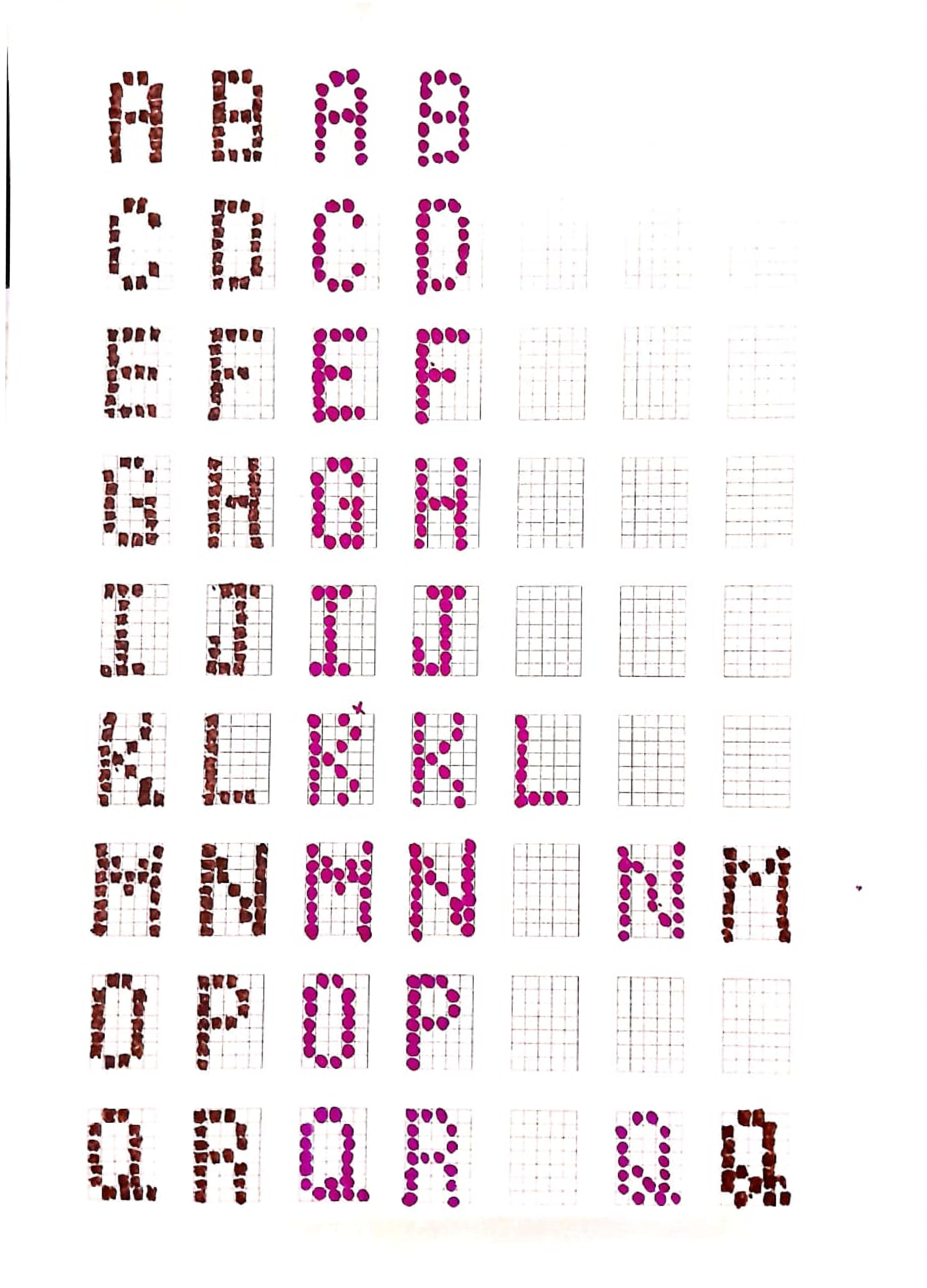
Evaluating Six Font Approaches
Each approach was evaluated against electrochromic display constraints, pixel limitations, and readability requirements.
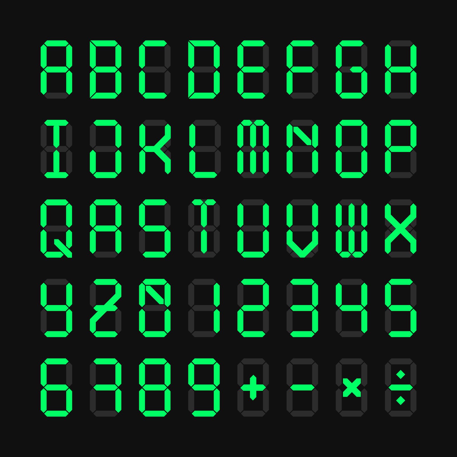
Pseudo-Stroke (Connected-Dot) Fonts
Strengths
- High legibility in low resolution
- Natural stroke continuity
- Good for Devanagari expansion
Considerations
- Requires careful dot placement
- Less traditional aesthetic
Pixel-Optimised Humanist Fonts
Strengths
- Friendly, familiar letterforms
- Strong numeral differentiation
- Open counters, varied weight
Considerations
- Risk of form loss at extremes
- Limited Devanagari adaptability
Segmented Hybrid Fonts
Strengths
- Extremely clear numerals
- Low error rate in poor lighting
- Familiar digital aesthetic
Considerations
- Weak for alphabetic characters
- Limited character flexibility
Blob / Cell-Based Fonts
Strengths
- Low visual noise
- Good for low-vision users
- Soft, approachable aesthetic
Considerations
- Softer, less precise
- Slightly reduced sharpness
Negative-Space Fonts (Carved)
Strengths
- Strong silhouette recognition
- High contrast perception
- Unique visual identity
Considerations
- Needs strict lighting control
- Not intuitive initially
Monoline Skeleton Fonts
Strengths
- Minimal and uncluttered
- Fast visual parsing
- Efficient pixel usage
Considerations
- Fragile at small sizes
- Low redundancy
Comparative Evaluation
Matrix comparing all font approaches against key evaluation criteria.
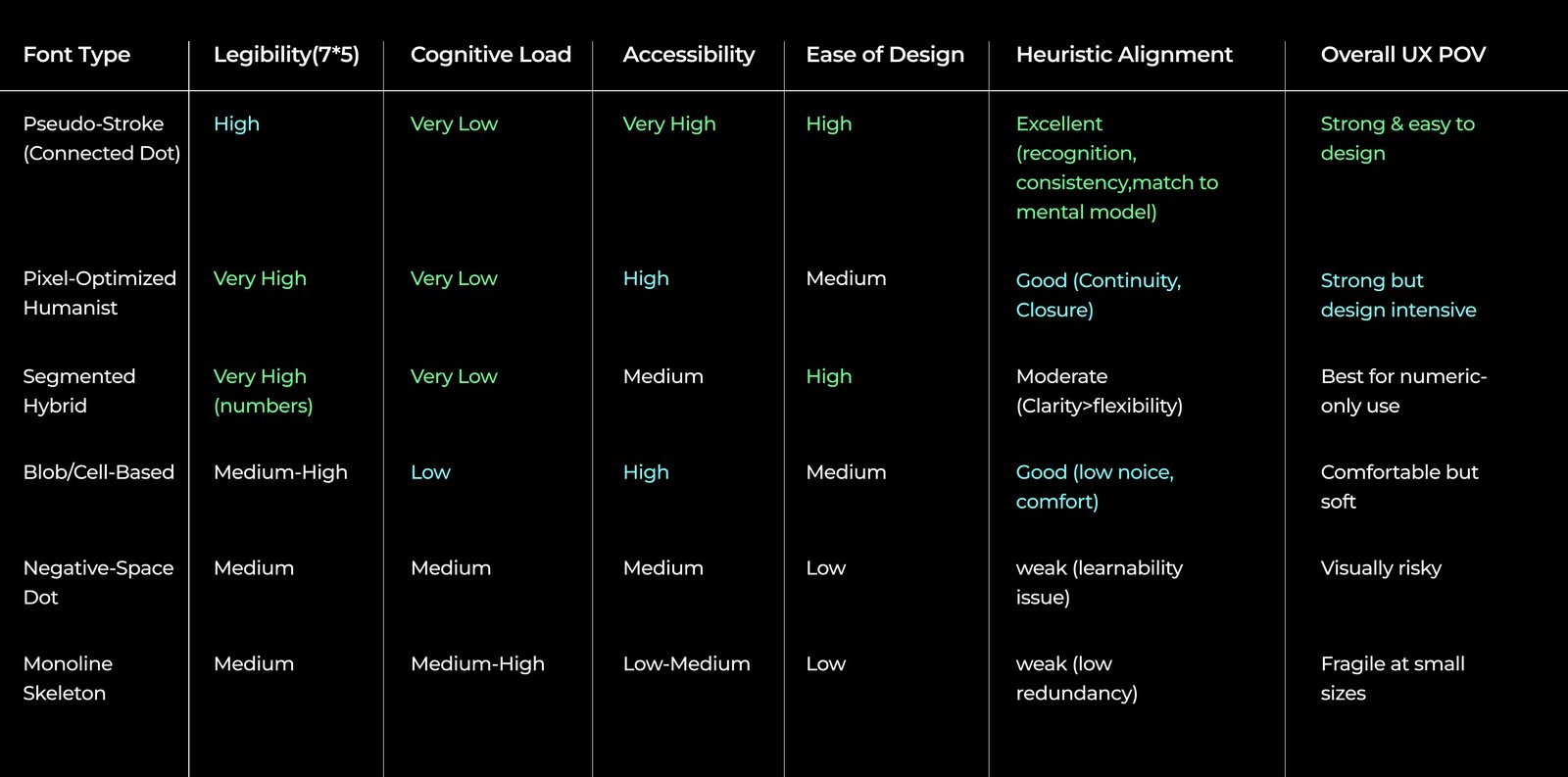
Key Finding
Pixel-Optimized Humanist and Pseudo-Stroke (Connected Dot) fonts emerged as the strongest candidates for 7×5 matrix electrochromic displays.
Recommendation
Humanist fonts excel in current use cases, but Connected Dot fonts offer better adaptability for future Devanagari script expansion.
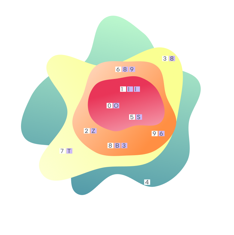
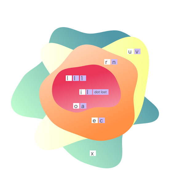
Character Confusion Risk
Expert consultation revealed commonly misinterpreted characters on 7×5 displays.
I / l / 1 O / 0 / D S / 5 / $ ₹
Vertical strokes collapse, oval shapes merge at low resolution
B / 8 / 3 6 / 9 / g Z / 2 / 7
Similar bumpy profiles, loop orientation ambiguous
U / V / W C / G E / F
Height differentiates, less critical for payment context
Interactive Confusion Heatmap
Click any character to see its confusion pairs and risk assessment. Colors indicate misread probability on 7×5 displays.
Full Heatmap Visualizations:
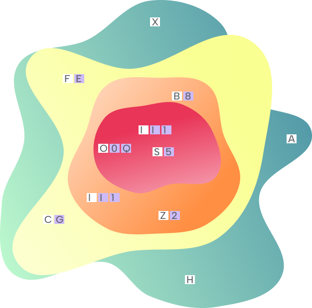
Character "A"
Low Risk
Commonly Confused With
Survey Evaluation Results
User surveys measured font preference between Pixel Optimized Humanist and Pseudo-Stroke Connected Dot fonts.
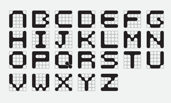
Why Rounded Pixels?
At typical payment card viewing distances (30–50 cm), the human eye cannot resolve individual pixels in a 7×5 matrix. Rounded dots positioned along character strokes create an optical illusion—they appear to connect into continuous lines.
This "connected dot" phenomenon is why we chose rounded pixels over square ones:
- ✓ Reduced visual noise — Rounded corners eliminate harsh pixel boundaries
- ✓ Implied continuity — Brain perceives strokes instead of discrete dots
- ✓ Better gestalt — Characters maintain recognizable silhouettes from a distance
Square Pixels
Sharp edges remain visible even when touching
Rounded Pixels
Squint your eyes to see dots merge into strokes

Try the 7×5 Constraint
Experience the difference between rounded and square pixels. Toggle between styles to see how rounded dots create the connected stroke effect.
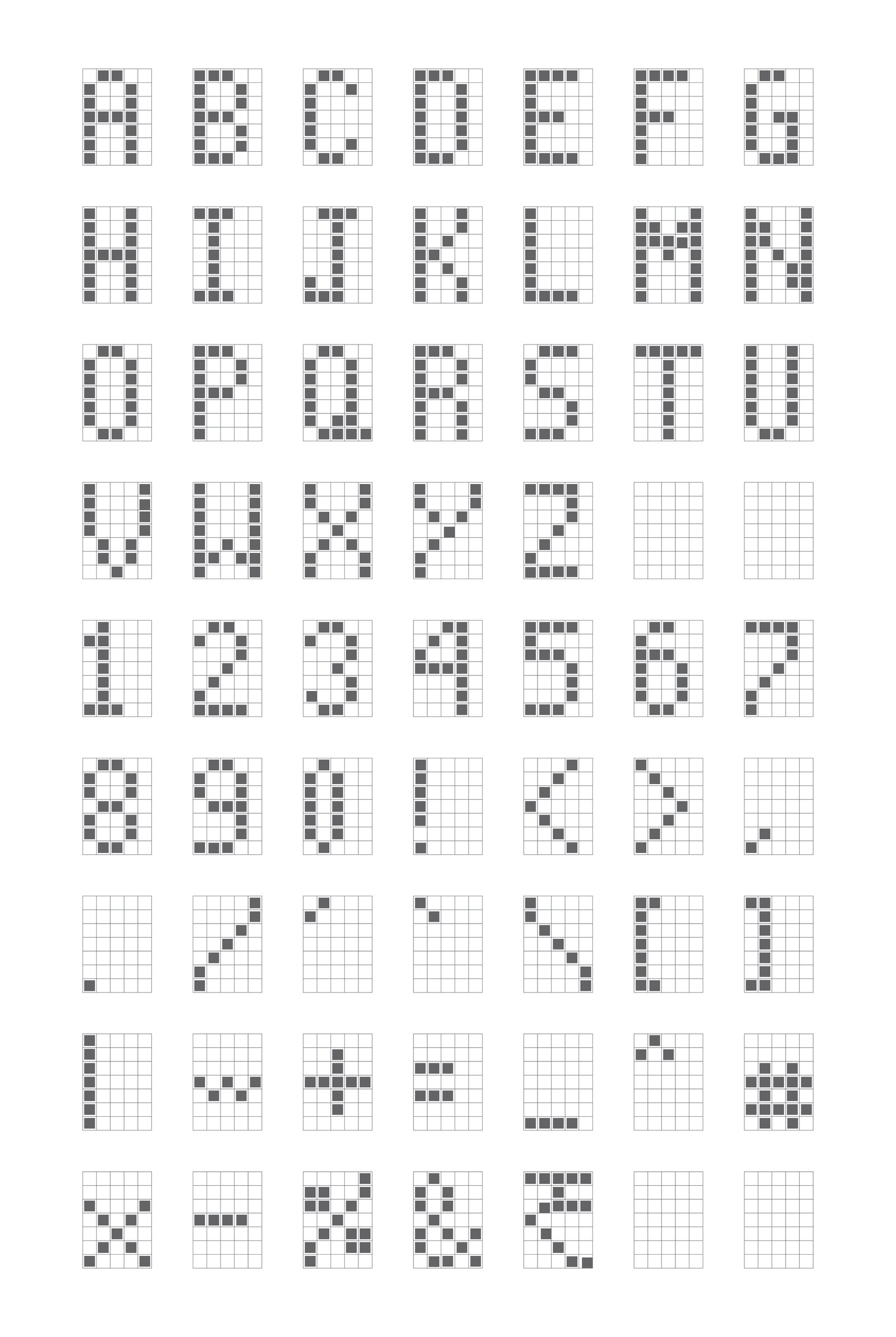
Key Constraints:
- × No anti-aliasing — pixels are binary (on or off)
- × Vertical strokes must be 1 pixel wide
- × Diagonals create "staircasing" visual noise
7×5 Matrix Editor
Click dots to toggle • Try drawing letters
At typical card viewing distances, rounded 7×5 pixel dots positioned along character strokes create an optical effect where they appear connected—forming legible characters that balance electrochromic display constraints with human readability.
Future Development
The Connected Dot approach was selected for its extensibility. Future development includes:
Devanagari Expansion
Adapting the system for Hindi and other vernacular Indian language scripts.
Grid Size Exploration
Testing larger matrices (9×7, 11×9) for complex characters requiring more detail.
Iconography System
Designing status indicators, symbols, and pictograms for the electrochromic display.
Final Outcome
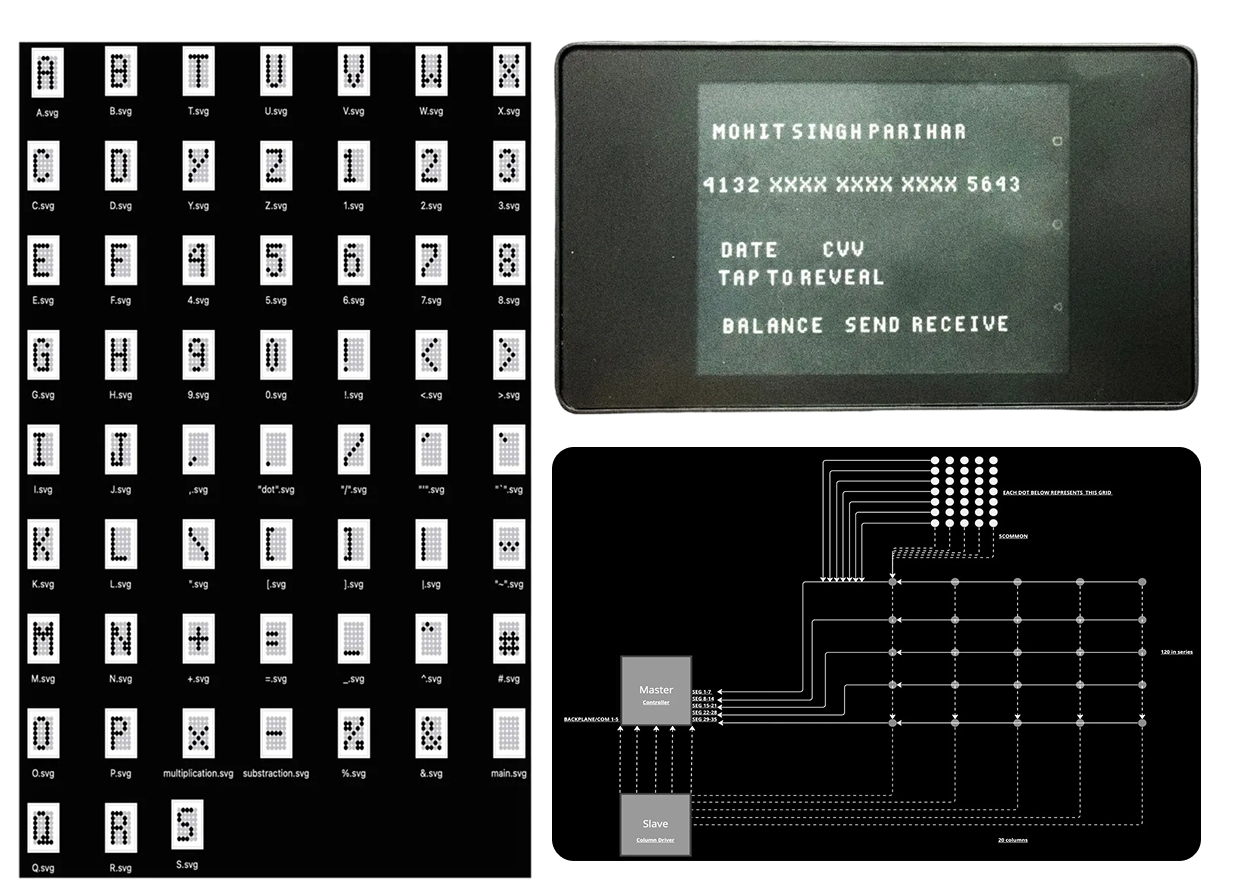
Real-World Implementation
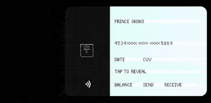
The connected dot font was integrated into a custom operating system designed for electrochromic payment card displays. The font renders transaction amounts, PIN entry interfaces, and system notifications with optimal clarity.
The design ensures legibility across varying lighting conditions and viewing angles—critical for financial transactions where misreading a digit could result in errors.
Further implementation details are under NDA.